The Philadelphia Phillies recently unveiled their new Nike City Connect jerseys on Friday, April 12 versus the Pittsburgh Pirates and have been met with varying opinions.
Reactions to the new blue, black, and yellow jerseys have been mixed with some people loving them, and even more people hating them.
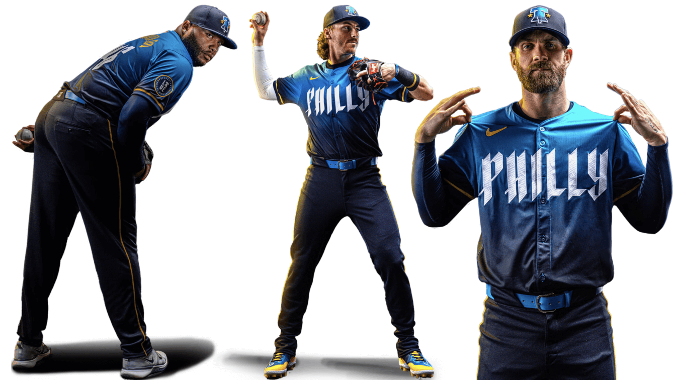
The jersey features the colors of the Philadelphia flag and includes text reminiscent of historical documents written at the time of our nation's birth.
The new uniforms also feature a prominent blue-collar representative of the blue-collar workers that Philadelphia is known for. Lastly, the jersey features a blue and black gradient that fades from the top to bottom.
From the perspective of a fan that enjoys the new jerseys, there are certain aspects of the design that stand out and make the new jerseys feel fresh and unique.
The Phillies jerseys are a classic staple of the MLB, sporting the iconic red pinstripes that fans have known their whole lives, without much deviation. Some see these new jerseys as a breath of fresh air and welcome the new addition to the jersey rotation.
The initial revealing of the jersey went poorly, to say the least, with people bashing the jersey for looking unprofessional, reminiscent of a beer league team. However, after seeing the jersey worn in the games, many fans came around to the design.
This is because the jersey was first unveiled as just a jersey, without the pants, hat, helmet, and accessories that go with it.
But after seeing players such as Alec Bohm wear the entire uniform, some fans completely changed tune and decided that the jerseys were sharp and fit the nighttime aesthetic that the jerseys are worn in.
The new hat features a blue liberty bell logo with the city skyline embroidered inside in a deep black, with two yellow stars to the left and right of the bell, embossed over a navy-blue cap.
The hat has garnered praise from fans, even those who dislike the jersey itself, and many consider it the highlight of the City Connect design. The same logo is layered over the batter’s helmets, which are sleek matte black, making the colorful accents pop off the helmet.
In contrast, some fans have noted that the City Connect jerseys were meant to celebrate the city’s culture, history, and identity, and ultimately, this execution fell flat.
From the design to the messaging, the Phillies and Nike missed the mark in capturing the essence of Philadelphia and its passionate fan base.
The Phillies opting to represent the Philadelphia flag for the jersey colors was underwhelming at best, as many fans have expressed that they had no knowledge of Philadelphia even having a flag.
While the intention may have been to evoke a sense of pride and charm, the color combination lacks the vibrancy and energy that represents Philadelphia.
Instead of making a bold statement, the jerseys fade into the background, failing to garner attention or inspire any kind of excitement.
Furthermore, the design fails to incorporate nods to Philadelphia’s rich history and culture.
The script used on the chest plate is a pattern that is supposed to resemble the Declaration of Independence and other documents like it, but realistically they look like the graffiti that paints the city instead.
The design feels generic, as the Phillies have already paid homage to the liberty bell. Where are the references to Philly’s famous cheesesteaks and pretzels, thriving art scenes, or even their iconic mascot, the Phillie Phanatic?
These elements could have added depth and authenticity to the design, making it resonate more deeply with fans and locals alike.
Another missed opportunity lies in the messaging surrounding the jerseys. Rather than leveraging the City Connect platform to engage with the community and celebrate what makes Philadelphia special, the Phillies opted for a vague and generic approach.
The slogan “Unapologetically Philly” lacks the specificity and relevance needed to truly connect with fans. The Eagles, on the other hand, have a slogan that fans are proud of, “It’s a Philly Thing.”
There is nothing unapologetically Philly about these uniforms. In fact, they should apologize for resembling a men’s slow-pitch softball uniform.
Overall, the Philadelphia Phillies’ City Connect jerseys failed to live up to expectations. They fell short with a design that lacked creativity and a message that failed to resonate with fans.